Archive
Quick Update November 12th, 2010
$SPX did break 1200 and then pierced the 20MA but was able to close above the 20. Is this bullish or is this bearish? I really don’t know but POMO was either a no show or was put aside for another day. There will be 18 more POMO days between now the middle of December.
***Adding this at about 7:25pm ET:
$SPXA50R has dropped 7pts to 74.20. This is not good as 75% is generally the line in the sand and it probably means that it is headed much lower.
$BPSPX has also dropped and I continue to say that it is not a good idea to add to current long positions or initiate any new long positions while this key indicator is dropping. To date, that has turned out to be pretty good advice.
$NYSI dropped by 54pts today and that is the biggest negative change for $NYSI since August 26th. This drop also took $NYSI below all the ST EMA’s I use and there was a Bearish X of the DI lines.
$NASI also had a substantial drop today.***
Look at $NYUPV and $NYUD:$NYUPV when these are updated over at Stock Charts, usually no later than 5:00pm ET. When you do, think August 11th and not September 30th.
There are bear flag patterns in the 60min time frame on most of the major indexes. I chose $INDU because the others have gaps. The problem I see is that three of these patterns have failed to date which increases the odds that the current one will fail, too. The difference now is that the RSI did drop below 30 on the $INDU and several other majors. This is the first time this has happened on these since the September low. This should indicate that selling is overdone, but because of deterioration in market breadth indicators you need to be extremely cautious, IMHO, of course. I’m sure that when $NYSI and $NASI are up dated later today, they will show down ticks and they could be substantial. Also, $BPSPX probably will show a down tick, as well.

Weekend Update November 7th, 2010
The Exuberatti showed up again on Friday. This is both good and bad, the yin and the yang, the dangerous opportunity. Bulls and Bearz will want to see this continue. Bulls need others to pile on behind them and Bearz will be watching for too much exuberance which could indicate that the market may have gotten ahead of itself and may need a cooling off period. Back in the March/April period, the Exuberatti showed up at the first of April but this didn’t impact the markets for almost a month. Comparing the market to the March/April period may not be wise because I think the only other rally that is a valid comparison is the March/April/May/June rally of 2009.
During March of 09′ the Fed began its purchases of U.S. Treasury Bonds, only they didn’t call it POMO back then. Back then the Treasury sold bonds to GS and after a couple of days, GS sold the bonds back to the Fed. The agreement between the Fed and GS is now obvious: provide liquidity to the equities markets or in layman’s terms, buy the dips.
Between the March 09′ bottom and late May of 09′, the market had eight 90% up days. And during this latest rally off the September/August lows the markets have had six 90% up days. No other time frames since the March 09′ low that I’m aware have had so many 90% days. My confusion with these days came about because one of the key characteristics of market tops is a 90% up day some time after a rally has been going for a while so when I saw that 90% up day on September 20th I figured the market was getting ready to roll. Then there was another 90% day on September 24th, and I was even surer. But obviously the market didn’t roll and that is because I was comparing the current rally to the wrong rallies of the past, or so it seems to me at the moment.
This past Thursday, we had a 97% up day and if my current thesis is correct then this has to be taken at face value and not as a climax buying event. But, of course, I don’t have a crystal ball and I could be very, very wrong about this.
P/C Ratio closed at .69 on Friday
ISEE All Equities closed at 251 on Friday
These two have in the past have worked well in warning of potential pull backs in the following session and lately these pull backs have been short lived buying opportunities so we’ll have to see if this holds true for Monday.
$SPX, $INDU, $NYA, $SOX, $COMPQ, $CYC, $RUT, and even XLF are either just at the upper BB or way above it. These probably need a rest and maybe a little pull back. Yeah, sure.
POMO Monday so who knows how this will play out. Maybe the only thing that will happen is that POMO recipients will, by agreement, buy the dip, should one occur, and contain the selling but not necessarily drive the markets back into the green. Next POMO schedule to be released on Tuesday and with QE2 then this will now continue for the next 7-8 months.
There was an article on the Nikkei Stock Exchange’s front page Thursday evening, their Friday session, that told how the Japanese govt was going to start buying ETF’s of the Nikkei. I was shocked when I read this because it reeks of market manipulation which I, of course, do not believe in.
Lowry’s issued a ST buy signal this past Tuesday. I have been having a tough time reading the markets lately but when I think about Lowry’s filp flopping back and forth over the past few weeks, with all their high powered computers, years of experience, and unimaginable data streams with Ph. D. math wizards to interpret it all, then I don’t feel so bad.
Op/Ex week so have to expect some volatility.
My simple mechanical trading system alerted that KRE was about to get a buy signal the other day. This has happened, and it happened in XLF, as well. I follow around 30 different indexes and sectors and using this system I can check them all in just a few minutes. Out of these 30 or so indexes and sectors, I only have Sell/Avoid signals on $VIX, $USD, $BDI, TLT, and BBH. Don’t be surprised if on Monday AMGN and & GILD find buyers and reverse the sell signal in BBH. I don’t know about TLT. $USD had a nice bounce Friday but it’s done that before and nothing has come of it and in light of QE2 then it probably doesn’t mean much. Famous last words?
Chart of KRE using my simple mechanical trading system.
Click here to open chart in new window.

Chart of the Big Daddy of breadth indicators. Note that the DI lines have had a bullish cross and that the ST EMA’s are already confirming the buy signal. If we really have started a new leg up, then $NYSI will rise over the course of the next few weeks to the 1200 level, +/-. This level has stopped $NYSI in the past but with the POMO wild card this may not be the case this time.
Click here to open chart in new window.

Next, a weekly chart of the $BPSPX. If you remember a couple of weeks back I was fairly certain that $BPSPX would rise into the low 80’s and then we might be getting over bought enough to initiate some kind of pull back. Well, the market consolidated instead of rising so that has now been pushed out. You can see on the chart that once $BPSPX gets into the mid-80’s it can stay there for three weeks or so before rolling over and bringing the market with it, or vice versa. $BPSPX rose 4.40pts this past week. If that rate should continue, then $BPSPX will be in the mid 80’s before the end of the coming week. Then it could take one more week to get above the 85 level and once there could stay there for two three weeks. Of course, anything could happen in the mean time, but unless something comes out of the blue, then it does appear that this particular rally leg could last another 3-5 weeks. Pure voodoo speculation.
Click here to open chart in new window.

Fibonacci projection targets for the $SPX using the July swing low, the August swing high and then the August swing low:
161.8% = 1231.15
200% = 1276.36
261.8% = 1349.49
And here’s where the Fibonacci projection gets interesting. If you use the swing low from March 09′, the swing high from April of 2010, and the swing low from July, you get a 61.8% projection of 1352. So now you have two Fibonacci projection targets that are in the same area. This is known as a confluence area. This area, should the $SPX get there, would offer up some pretty tough resistance and it may be difficult to get through. Assuming that $SPX even gets up into this area, then this area might be the place where a major pull back would start. That pull back would be necessary to build strength to through this confluence area. However, once through this area then $SPX 1350, or so, would provide major support. I wouldn’t expect $SPX to be anywhere near these areas for several months, if then, and, of course, this is all pure voodoo speculation for now but something to keep an eye on.
Next is a weekly chart of the $NYA from 2005 through the end of 2007. The main thing I wanted to point out is the RSI and the fact that the RSI rose up above 70 several times which would have certainly indicated a fast moving strong rally. Note also the number of times $NYA either tagged or pierced the upper BB’s and market reaction when this occurred in conjunction with the RSI being above 70.
Click here to open chart in new window.

Now for a current chart of $NYA that shows that the RSI has yet to rise above 70. My point is that there is still plenty of headroom for the market to move up through. The fact that $NYA closed outside the upper BB may mean it needs to cool off for a bit but it also indicates market strength.
Click here to open chart in new window.

Charts courtesy of StockCharts.com
Time:
$NYSI could take 3-5 or maybe more weeks to rise to the 1200 level, stall, and then roll over. $BPSPX could take 3-5 weeks to make the round trip from below 80 to above 85 and then back below 80. $NYA could take several weeks to get its RSI above 70, if it happens at all, and then have the RSI roll over and drop below 70. If all of the above were to happen in the time I’ve laid out, that would put us into early December which is about when a Santa Claus rally might be expected. Pure voodoo conjecture at this point but can’t be ruled out as seasonality favors longs for the next few months.
Finally, a chart of the SG for the $SPX showing that after falling in a down trending channel for the last couple of weeks, it has now apparently bottomed, broken out of the down trend, and is now in the first stages of a new up trend.
Click here to open chart in new window.

Based on the breakout in financials, the rising $NYSI, and the breaking of the down trend in the SG for the $SPX, I have fired up my portfolio over at The lion. Anyone who has been following this blog for a while knows that I tried to short IWM via TZA back when TZA was around $28. I took a $2 loss on that trade and that was the last time I tried shorting the market even though, based on breadth indicators, etc, I really believed the market was going to roll over. In my Lion portfolio I went in all short and that proved to be totally wrong. So instead of looking at the losses in that portfolio, I decided to delete the entire portfolio, including my good trades, and start over. In the next week or two I’ll be adding several more stocks and ETF’s to that portfolio many of which will be based on strong Relative Strength readings. Here is the link to my Lion portfolio, if you’re curious.
Good luck in the week ahead. As any paranoid trader knows, the market constantly presents dangerous opportunities.
Quick Update October 29th, 2010
It’s not your monitor. Except for $COMPQ/$NDX, $SOX, & $TRAN, the other markets have gone nowhere in the past two weeks. IWM is up $0.01 cent over the past two weeks. $SPX is up about 7pts. $INDU is up about 60pts. $CYC is flat. $NYA is down 13pts. XLF is up 2ocents.
What can you do in a market like this unless you’re willing to chase the Q’s or SMH or maybe IYT?
Below is a chart of the $SPX and I have redrawn the lower trend line so I no longer have three touch points which to me means the trend line lacks any real authority. $SPX has drifted sideways and has moved below the previous lower trend line I had drawn but it hasn’t really broken down so this trend line will have to do until that happens.
I did a Fib projection for the $SPX and the next target, the 138% level, is up at 1203. I’m not saying we’ll get there, but that is the next level which to me seems a natural since markets do like to flirt with or take out round numbers. We will see.
Click here to open chart in a new window.

I posted a question to Cobra on his blog last night asking him about the separation between the cumulative $NAAD and the $COMPQ and he pretty much said what I’ve been saying and that is that the rally in the $COMPQ is being carried by just a few of the heavy weights. $NAAD did tick up today but it has put in a much lower high so there we have a pretty serious instance of negative divergence set up again. But none of this stuff is really having much influence on market direction and given enough time these divergences can get back in step.
AAPL and GOOG make up almost 25% of the $NDX/QQQQ’s and while they were down seriously today, the Q’s managed to get away with a drop of a few cents at the close. Think about the computing power it takes to engineer an essentially flat day for the Q’s when 25% of the index is getting hammered. This doesn’t happen by accident. The mad men at the helm knew just what stocks in the $NDX to buy and at what price to buy them at to compensate for the pounding that AAPL and GOOG were getting. Of course this supposes that the markets are 100% manipulated and I would never ever suggest any thing of the sort.
Have a good weekend.
Update October 25th, 2010
All Up Day fails to produce a red day.
$VIX and $SPX close green, which has a pretty good record of producing a red day in the following session, however, since All Up Day failed then this might fail, too.
TXN and BRCM, both in the $SOX, not being treated well in the AH at about 6:00pm. Not being trashed but maybe no huge gaps up for them tomorrow which might stall rally in the $SOX. But don’t count on it or bet on it, IMHO, of course.
XLF, which has been on my Avoid list for quite some time, has now given a fresh sell signal. Funny that when I point these things out, THEY rally that sector or index on the following day so don’t laugh if it happens.
$USD was totally trashed in the overnight markets and early in this morning’s regular session, and when it bounced from the low I have of 76.85, the market came back in with the $INDU closing 115pts off the HOD, which happened to occur at the same time the $USD bottomed. Hmmm.
Lots of shooting star candles out there but they mean nothing without confirmation, which would start with a close below today’s low. Until and unless that happens, they’re just candles.
I think it’s obvious that the Pro’s sold the close, but the bottom line is that while there are some signs of weakening internals, trend lines continue to hold. IWM, which looked to be in trouble last week, is now pennies away from a new rally closing high. Bulls remain in control, but they need to pay close attention to the $USD as other countries may intervene in the FX markets to stop the dollar’s decline which could begin the unwinding of various carry trades and put pressure on equities.
Weekend Update October 23rd, 2010
Bulls vs Bears
Before I get started, I want to point out that while I would love to see a pull back of several percentage points I am not looking for nor do I expect any kind of bearish crash scenario. A 50% retrace of this latest move would take the $SPX down near the 50MA and that would be great. Pull backs are healthy and cleansing for the market as they give participants a dose of reality. If the rally is indeed strong and lasting in nature then it can certainly endure a pull back, should one materialize.
$USD doesn’t go in either category for the moment as the G20 meeting this weekend will probably play a role in its direction, so it’s a wild card.
Bullish:
Trend lines continue to hold and that’s really all that matters. MACD Bearish X’s, DI line Bearish X’s are merely cautionary events without a failing trend line. Sometimes markets correct through time rather than price and a MACD Bearish X becomes a MACD Bullish X in time. $SPX, $NYA, $INDU, & $RUT all have MACD Bearish X’s now but nothing has come of this yet. Momentum may be on the decline, but it hasn’t left to the point where trend lines are failing. Until then, party on.
50MA crosses up through the 200MA on the $SPX, $COMPQ, & IWM, though not the $RUT. Thanks, Chris.
$SOX index rises 2% on Friday based on earnings from SNDK, I think, though SNDK did close in the red. If $SOX can take out the recent swing high of 358.47 on a closing basis, then this will doubtless have a positive effect on the $COMPQ, $RUT, and to a lesser extent the $INDU.
Huge short positions in the ES and NQ futures contracts continue to provide fuel for every step higher as shorts are forced to cover.
$NYUD, the cumulative, looks okay here. It needs to get some mojo or it risks rolling over. Click here to open chart of $NYUD in new window.
$BPSPX continues to climb. It did waffle on Tuesday which created a down tick on its Stochastic. The Stochastic is now trying to right itself but I hold that as long as the Stochastic continues to waffle then entering new long positions at this time is risky. This was the case for last week.
$SPXA50R is at 88.40% and somewhat stable. It appears to have peaked but hasn’t really lost much ground since doing so.
P/C Ratio at .87 is slightly bullish.
$VIX has dropped for the last three sessions and could easily take out the recent low of 17.90. $VIX:$VXV doesn’t appear to be a factor at the moment.
$NYAD, the cumulative, closed at a new high on Friday while $NYA missed making a new closing high by less than a point. You could say this is positive divergence between $NYAD and $NYA, but it’s really too close for me to call.
$NAUD, the cumulative, made a new high on Friday while $COMPQ missed making a new high by a little more than a point. Again, you could say this is positive divergence, but for me it’s too close to call.
Earnings keep coming in better than expected, of course. Stocks that beat their already lowered estimates are being hugely rewarded but this is a double edged sword. If this trend continues, then these earnings will bolster the rally. On the other hand, if some influential heavy hitters start missing, the way GE did, then that probably won’t be looked upon very well.
Bearish:
AAPL . Something going on with this stock. Maybe just a one-day pull back, but if profit taking in AAPL continues, then it could pull the market down with it.
Volume. Where is it? Indexes had volume close to what it was on October 11th, which was also in extremely light volume day. IWM volume was the lowest of the year. If there are buyers out there, then why isn’t their presence showing up in volume?
Lowry’s issues a new ST sell signal this past Tuesday. See Lowry’s Data for details.
$NAAD misses making a new high by 500pts while $COMPQ barely misses making a new closing high Friday.
Lower highs for many indexes, including $RUT. But no lower lows yet.
XLF closed flat Thursday and Friday. How is that even possible? Financials continue to weigh down the markets.
Click here to see Cobra’s warning that Friday was an All Up Day. He says that this particular set up hasn’t failed since 2007 in bringing about a red day in the following session.
Zweig Breadth Thrust is not really confirming the last several days of this rally.
$NYHGH went to 404 on 10/13 and has been putting in lower highs since. It took quite a hit this past Friday as the $NYA seemingly rallied. The silver lining with $NYHGH is that it is putting in higher lows.
$NAHGH also put in a rally high on 10/13 and hasn’t matched that since. More troubling, though, is the fact that it dropped this past Friday while the $NDX and $COMPQ rallied.
$NALOW rose by one issue to 27 on Friday. 27 is more or less neutral, but this needs to be watched.
$NYSI, the Big Daddy of breadth indicators, has had down ticks for 5 out of the last 6 sessions. This is a warning that breadth is deteriorating but it is clear that breadth has not deteriorated to the point of causing the market to roll over. $NYSI can reverse and a new rally leg can start at any time. If you traded solely on $NYSI weakness back in March/April, you would have missed a good part of the rally, but all of the decline.
The following chart shows what longs are up against now. $NYSI can flat line for a while longer, like it did in March/April, or it can fall off a cliff, like it did in June and again in August.
Click here to open chart in new window.

Last weekend I said that I thought we could get two more weeks out of the rally. I also said that I thought this coming week would be choppy. Well, last week the rally did not live up to my expectations. I thought the markets would rally hard, get the bulls to the frothing-at-the mouth level of euphoria, and help set the stage for a pull back, none of which happened. Regardless, I still think the market will be choppy this coming week, and it may actually pull back, though I will believe that when I see it.
Finally a chart of the SG for the $SPX. After essentially flat lining for a month, the SG has finally broken out of that parallel channel and is now in a down trend. This indicates that the strength necessary to keep it in this holding pattern is waning. Longs will want to use extreme caution until the SG bases and then reverses, which could happen at any time.
Click here to open chart in a new window.

For people new to the blog, you can click on the spreadsheet link in the Blogroll section and follow this on a daily basis and make your own charts. I usually update the data each evening.
If you’re not wearing your paranoia on your sleeve, where are you wearing it? And never forget that money in the market is money at risk.
GL in the week ahead.
(Added at about 2:20pm, Sunday October 24th:
If you don’t already visit Trader’s Narrative to read the weekend post, you are missing out. Click here to open link in new window, and be sure to bookmark the site.)
Update October 4th, 2010
If you haven’t, be sure to read Cobra’s post from Sunday.
Three 90% up days long after a bottom. Unprecedented.
Third consecutive distribution day for $TRAN.
$TRAN, $SPX, $INDU, $NYA, $COMPQ, Q’s, IWM, & $CYC, get Parabolic SAR sell signals as well as slow Stochastic 20,20 sell signals.
$NYSI goes negative pushing $NYMO below the zero line, its +DI line has a down tick, and its ADX line stalls. $NASI not as bad but this has been the leader so expect indicators to turn more slowly.
$NAMO pushed through its lower BB today. Could mean a bounce for Tuesday.
$BPSPX stalls today.
$SPXA50R loses 3.40pts or 3.94%, but remains nicely above 75%.
P/C Ratio closes at .81 indicating ho, hum attitude.
$NYA50 has largest drop since 8/18.
$NYA150 has largest drop since 8/23.
$NAA50 has largest drop since 8/30.
$NAA150 has largest drop since 8/30.
80% down day.The last piece of the puzzle.
My study of market tops shows that once there is a 90% up day after a move has been going for a while, then there is usually a day that is marked by 80% of the volume being attributed to declining issues. This 80% down day is usually not a big down day itself but the harbinger of big down days to come. Look at 8/10 for clues.
I’ve been waiting for such a day and today 78% of the volume on the $NYSE is attributed to declining issues. This is close enough, making this an important distribution day. 99.999% of retail investors are clueless about the significance of today’s lopsided internals and will see this as just another dip buying opportunity. They could be right, but history says that it is more likely that the market will decline from here.
History is the only thing I have to go on. I’ve studied each top since the March 09′ lows and have mentioned certain characteristics that are present at each top. Each time these characteristics have been present, the market has rolled over. But this top is a little different in that we’ve had three 90% up days, negative divergences have come and gone, and the $VIX punched through its lower BB ages ago. Still, history tells me that there is a very high probability that a market top of some degree is at hand and that the decline is yet to begin.
120min chart of IWM showing that IWM is still above longer term trend line and is now in a sideways pattern that could turn out to be a Bull Flag.

Chart courtesy of FreeStockCharts.com

Chart of Transports showing sell signals all over the place including MACD sell signal legitimized by break of trend line. Note the increase in volume on the down days, including today.

Chart courtesy of StockCharts.com

SG stuff: Number today for the SG for the $SPX is 46.66 which means it has now taken out its previous low from 9/23 of 47.32.
GL
Weekend Update September 5th, 2010
14 vs 5
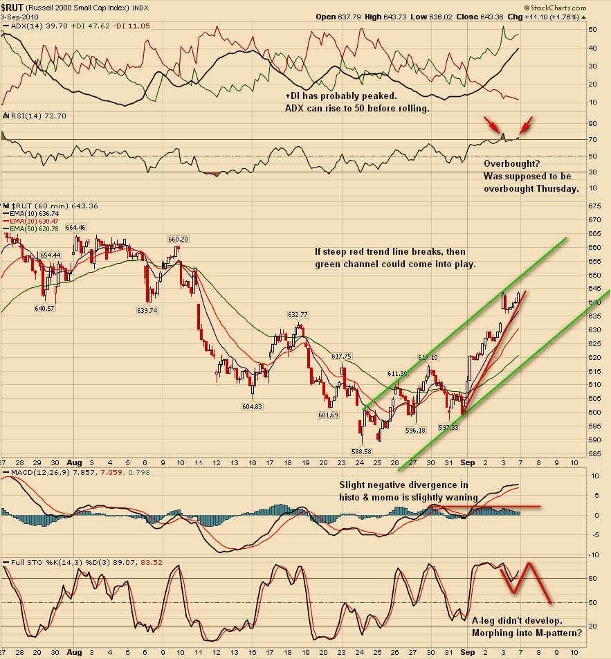
Click here for updated, longer term, $RUT/IWM 60min chart.
I want to point out that while I am ST bearish or cautious I am IT bullish and that there is no way I will short against rising Summation Indexes, $NYSI or $NASI, or a rising SG. The main reason I took profits on Friday is because I chose to play the 3x’s and while the rides up are great, the draw downs not so much. I will be looking for a buying op once the market consolidates or pulls back.
Those three 90% up days in the past six sessions, along with high $TICK and low $TRIN readings, should be a concern for bulls. While the 90% up days are certainly bullish, three clustered so close together hints of buying exhaustion. But that is yet to be determined.
This chart of the $VIX suggests over exuberance and clearly shows a lag time between the $VIX breaking below the lower BB’s and market tops. Based on this chart alone, I see absolutely no reason to hurry in on the short side. Charts of $VXN and $RVX look just like the one below.

All Stock Charts charts courtesy of StockCharts.com
This chart of $SPX is about a bullish as it can get, although a bit extended; however, there are a couple of red flags on the chart. Chaikin Money Flow is not confirming Friday’s mega rally, and $SPX is not alone. This same kind of divergence is apparent for $TRAN, COMPQ, IWM, Q’s, and I’m sure a couple of others. The chart also shows that the faster moving 5,3,3 Stochastic is at extreme levels and this is also true for several other sectors and ETF’s including Q’s, IWM, $CYC, $RIFIN, and IYR.

While the market may be extended, this charts suggests that there is still some upside left, which goes along with the $VIX chart.

This ZBT chart indicates that the market is overbought but suggests that it may take a few days for the market to realize this. Note that when ZBT peaked on 7/26 the $SPX only gained 10pts more before starting its roll. I’ll be watching for a higher high on Tuesday or Wednesday but I don’t know if it will happen.

Chart courtesy of FreeStockCharts.com
If there is a sector that is so overbought it should have a reaction Tuesday, it’s the REIT’s and especially IYR. I will be looking for another DRN buying op once the expected pullback in IYR ends. Of course, IYR could just continue its parabolic move. BTW, that’s not a dragonfly doji, but it is a doji and hints of profit taking and indecision. Google ‘Bearish Doji Star.’

The main reason I’ll be looking to buy dips for now is this chart of $NYSI with ADX. Until this chart and it’s $NASI cousin start to break down, then buying dips is the less risky strategy.

Finally a chart of the SG for the $SPX showing that the SG has broken out of its downtrend and is rising. This indicates that the market is moving up with increasing strength and confirms the current move. As long as the SG keeps moving up then I have to remain bullish as the SG has proven time and time again to be a better trader than me.

In the week ahead, watch your 60min charts. Based on RSI readings over 70 for most indexes and key sectors in the 60min and 15min time frames, the markets are overbought and need a cooling off period in order to digest recent gains. The markets need not pull back to slough off their current overboughtness but can deal with this through time in a sideways consolidation. Be careful trying to front run on the short side and be extra krispy careful trying to short the REIT’s.
IMHO, of course, subject to change at any time.
GL
P.S. While the ECRI data from a couple of weeks back suggested a double dip recession may lie ahead, railroad load data is not currently confirming this, yet. Link to your right and be sure to scroll all the way down to the bottom of the page.
(Adding the following at about 3:00pm ET on September 5th, 2010)
This is what my Lion portfolio looked like at the end of trading on Friday. I don’t think it will go negative between now and the next ‘buy’ signal I get, but I do think that much of these fantasy gains will evaporate in the mean time. In my own accounts, I did not play either FAS or TNA over the past week. I cannot figure out how to link this to the SG Portfolio as it requires a log in for even me to see.

Weekend Update August 15th, 2010
The biggest problem I see for longs at this point, outside of the fact that the charts have “Sell” or “Avoid” written all over them, is the low P/C ratio, which closed at 1.0 on Friday and only went to 1.07 during this past week’s decline. That’s just too low and hints at a little too much complacency. Friday’s low ISEE #’s suggest that puts are being bought left and right, but this is not being confirmed with the P/C ratio. You would think with the $VIX gapping up through its BB’s that the P/C ratio would have climbed up into the 1.20’s, but no. These indicators are sending out mixed messages which seems the norm over of the past week to ten days.
By contrast, the following chart was sending out a very clear message. I only stumbled upon this combination this past Friday and have had very little time to back test it so your mileage may vary. The key is to look for divergence between the # of new daily highs and price action. About 98%-99% of the time, $NAHGH and the $COMPQ confirm each other, but you can clearly see the negative divergence that began after the July 26th high. As of this past Friday, we now have two days of positive divergence. That’s good, but can easily change on Monday.
Oscar is always saying that flat tops lead to market drops and it would be interesting to go back and look at other flat tops using this setup or $NYHGH with $NYA/$SPX. BTW, there was also a negative divergence between $NYHGH and $NYA/$SPX, but it wasn’t as obvious.

Chart courtesy of StockCharts.com
I have no idea which way the market is going to go next week. Option market makers will probably have a lot to do with market direction. But I think one thing is certain: We ain’t going no where until the $SOX index either quits dropping or changes course. Stocks like AMAT, MU, LSI, & AMD have been absolutely destroyed over the last 3 months and if there’s anymore selling in SNDK or if ATML gets taken to woodshed you can kiss the $SOX index goodbye. It truly is the Lost Index and this is going to continue to be the case until selling slows or ceases in the key stocks in the index, INTC, AMAT. INTC only makes up 2.23% of the $NDX but it is an extremely important stock and it is exerting tremendous downward pressure to the $SOX, $COMPQ, $NDX, and to a lesser extent the $INDU. The way INTC is moving it looks certain to take out the July lows and then it’s on to the Feb lows, which are perilously close. If the RSI on INTC’s daily chart drops below 30, don’t be surprised to see INTC trading in the 17’s within a week or 10 days. Since I am long the Q’s via TQQQ, this is something I do not want to see so I am watching INTC, SNDK, & ATML like a hawk.
In other news:
I’ve been mentioning the ECRI #’s over the past couple of weeks and the ability of negative ECRI #’s to predict a recession 6months in advance. This may or may not be accurate based on three other sources. The first is the $BDI, which has been rising since mid-July indicating that demand for container space is allowing shipping companies to raise their rates for the first time since the first of June. Next, railroad data, see the Rail Fax link to your right and be sure to scroll all the way down, is showing good growth so far this year and remains in an uptrend. The uptrend does appear to be slowing a bit but a trend is a trend until it isn’t. Lastly is Ceridian’s last report, which came out on the 11th. This report shows a significant rise in trucker activity in July vs the June period, and this is a good thing. Based on the report, Ceridian projects current quarter GDP to come in around 4%, as long as trucker activity doesn’t slow or change course. Caveat, caveat, caveat.
The following chart of the SG shows that it peaked on August 4th, waffled around for a couple of days, and then began to drop. The red trend line is speculative as the erratic behavior of the SG lately makes drawing a trend line difficult. If the July 19th and 20th lows are taken out this coming week, then a break of the red trend line on the SG is legitimate and ominous.

The $VIX closed back inside its upper BB’s on Thursday and Friday and produced a large black, reversal-type candle on Thursday. To signal a ST bottom, the $VIX needs to close below 25.18 before it closes above 27.21. $VXN managed to close just above its upper BB and for it to signal a ST bottom $VXN needs to close below 26.47 before it closes above 28.95. Long or short, these need to be watched carefully, especially on Monday.
While I don’t really see any reason to initiate new long positions at the moment, I do think, based on the action in the $VIX/$VXN and $NYUPV/$NAUPV and other indicators, that shorts may have squeezed about as much out of this drop as is possible. The one thing that would flip me to the bearish camp would be a break of the swing lows from July 19th/20th. Do that with conviction and the early July lows probably won’t hold and I’ll be doing the Hokey Pokey with the bearz.
GL in the week ahead.
Weekend Update August 7th, 2010
I am now using six different indicators to track the SG for the $SPX but still calculate the value of the SG with the original four indicators. Using six indicators gives me a broader view of whats going on below the market surface. As I have mentioned over the past week, one of the main four indicators, a momentum indicator, has been having down ticks since Friday, July 30th. This past Friday, August 6th, two of the other main indicators began showing signs of a loss of upward momentum, though neither did actually tick down. Also, one of the indicators that I track visually is also showing a loss of upward momentum. When the first of my main four indicators began to tick down on July 30th, I said that it was an early warning signal and that it can be about two weeks early, and this remains the case. This puts the focus on the coming week and I fully expect that one or more of the main four indicators will begin to tick down and then this will be a major red flag. Still, nothing happens without confirmation from the market. The idea is that when the SG begins to fall and then is followed by a market fall, dip buyers, who have only been marginally successful lately, will be less so until, most likely, there is a climax selling signal from $NYUPV.
Here is a chart of the SG for the $SPX, which I believe has topped.

I added to my positions in UWM on Friday at 29.05 & 29.10. These trades were executed right around 2:30pm and, of course, I had no idea about what was going to happen next.
I added to these positions for a couple of reasons but mainly because of what was happening in $NYUPV at the time. Early in the session, $NYUPV dropped down to around 30 and stayed there for quite a while. Then it began to climb and got up around 120-130, which I didn’t want to see. Later, $NYUPV dropped again and hovered around 60. I figured, based on internals, that $NYUPV would close in that area and give a ‘buy’ signal for Monday so I decided to scale in a little with plans to add a little more during the expected residual selling phase of a $NYUPV signal. I may have been smart by half and I’m either going to be a hero or a zero on Monday.
This 60min chart of IWM shows another reason I decided to add to UWM, though it was, at the time, secondary to what was happening in $NYUPV. Entering a trade based on an RSI that has dropped below 30 and then reversed has, in the past, proven to be fairly reliable in the 60min time frame. It may or may not prove to be such this time.

This 15min chart shows a couple of things I was watching on Friday, mainly the trend line and the Bullish X of the -DI line down through the ADX.

And now for the bad news. IWM had a Bearish DI X on Friday, as did XLF. I’m sure there are others that did the same and there are many, including $TRAN and $CYC, that look vulnerable. According to the way Ron Walker, thechartpatterntrader, explains the Extreme Point Rule, you mark the low of the day there is a Bearish DI X and then a ‘sell’ signal is generated when there is a close below that day’s close. And that’s not the only thing wrong with the daily chart. Note where IWM is in relation to the upper BB of the Mystery BB’s. I do not have the 20MA, the 50MA, or the 200MA on the chart, but they are all sitting right where the tail end of the wick is. Some will say that IWM just successfully tested this key support area and this is a possibility. A close above the upper BB at 65.21 would give that argument more credibility. However, since I expect market weakness to become obvious in the week ahead, any close above 65.21 and higher risks being short lived, IMHO, of course, subject to change at any time.

Chart courtesy of StockCharts.com
It’s not likely you will see a chart like this for quite some time. Only the Big Boyz and their super computers can keep major indexes suspended in this way. Stealth Distribution???

Never forget that the stock market and the economy are two separate and distinct animals. From time to time they appear to be in sync, but this is coincidental. The stock market is all about making money, period. If THEY determine there is money to be made on the long side, then THEY will run the market up. The same is true in reverse. And why did THEY run the market up late Friday? Truck load after truck load of $$$$ made through share turnover that was partly due to short covering and retail investors who were chasing the rising market. Remember, THEY were covering their shorts and going long on those big red candles while retail investors were selling their longs and going short. As an example of how much money was made Friday in the run up, IWM moved 2.1% from its intra-day low to the high of the last candle. If you were in a 2x ETF, then that’s a 4% move, yada, yada, yada. But GS and all those huge hedge funds are leveraged out as much at 30x -50x times and think about the $$$$ they pulled in on that move plus they also have long positions that they need to protect so while the move late Friday surprised me, it’s not as if we haven’t seen it before.
Lowry’s is updated and is certainly not what I expected.
Quick Update July 30th, 2010
For the record, I gave back almost all of my gains I boasted about last week. Serves me right for boasting. I barely paid for the commissions on some trades. The mistake I made, which chewed up most of my gains, was buying SOXL, which is why I did such a hard look at the $SOX last night. $SOX is now on a confirmed ‘sell’ signal after first breaking its accelerated trend line and today it had a Bearish MACD X.
I am back to cash and glad of that. The markets over the past two days have been difficult for me to read and for me that means stepping aside until there’s clarity. While I’m not surprised THEY pumped the market up into the close, I did not see it coming, based on my read of internals.
I’m not ready to give up on this particular move, but my view may change once I’ve had the time to run through charts of all the major indexes, key sectors, and as many as 20-30 not so key sectors.
The $SPX and $INDU closed positive for the week (My mistake on the $SPX. Down 1.06pts) which on the surface looks good. But there has been stealth distribution going on beneath the surface, or at least that’s what I call it. Stealth distribution happens when you have an elevated $TRIN throughout the session and/or at the close, but the market doesn’t seem to react. Tuesday the $TRIN closed at 1.00, but every day since then, including Friday, the $TRIN closed above 1.xx meaning that the market was being held up while the Big Boyz exited quietly via the side door.
Europeans will be on holiday most of August and many of the big players on Wall Street will be at the Hamptons or out on Fire Island. The lower than expected GDP number and the ECRI number, which now stands at -10.7, along with the absence of so many during August, may make August a difficult month for traderz.
And never forget that paranoia is just a higher form of awareness.
