Archive
Update December 8th, 2010
$SPX makes a new closing high today but did so on lighter volume. Volume on 11/5 was 4.6 billion shares and today’s volume was 3.8 billion so not very convincing, but for the moment is just a footnote. Also, last night Stock Charts added in C’s 3.3billion shares after I made my original post so if they do something like that again, then it will throw off the volume. WSJ did not add in C’s volume, btw. So the round trip from the 11/5 high to today’s new closing high took about 23 days. Meanwhile, as I’m sure you know, neither $INDU nor $NYA made new closing highs today.
5-Day Arm’s at 3.13 and I have to wonder if this isn’t being skewed somewhat by the high volume in the financials over the past few days. If so, then it’s meaningless. If not then this is just showing way to much exuberance which is going to have to get worked out of the system one way or the other.
$NYSI had a negative tick today. In a robust market this shouldn’t be happening. Plus the $NYSI is below 500 which is bearish to begin with. Maybe tomorrow this will tick back up. Maybe not. You can watch advancing stocks vs declining stocks throughout the day to get an idea on what will happen to $NYSI after the close. $NYA50 & $NYA150 dropped today which is what you would expect when $NYSI drops, but is not really what you want to see on a day when the $NYA closes green.
Along with the negative divergence in $NYSI, you also had negative divergence in $NYHGH, $NAHGH, the cumulative $NYAD, and, to a lesser extent, the cumulative $NAAD. Not like this hasn’t happened before and been completely ignored by the markets in general but you never know.
Tom Drake’s 2CS has dropped to 64.16 and continues to show perhaps a little too much exuberance but so far no problem.
My biggest concern at the moment is the capital gains increase on January 1st and all the insider selling and others who may also want to avoid paying the increase. You just have to wonder if there’s enough POMO $$ around to keep up with all the selling that could materialize over the next couple of weeks.
Quick Update November 29th, 2010
4:05pm
Dearest Spammerz:
How stupid can you be? Haven’t you figured it out by now? You even have a wordpress blog so you know the levels you have to get through before your spams can post. It’s so funny. I can’t help myself from laughing at you each time you try to post a message.
But, hey, whatever!
*****
$VIX blew through upper BB so market just got oversold and reacted.
Cumulative $NYUD and $NAUD putting in higher lows and forming an uptrend, of sorts. Don’t read too much into this until we start to get some strong green days.
Cumulative $NYAD and $NAAD same as above.
$NYMO and $NAMO same as above.
Financials rallied today and spared the market a serious drop, but can they rally for two days in a row?
Pre-Market Update November 17th, 2010
$NYMO blew through lower BB’s and is oversold. If the $NYA should close lower today, watch $NYMO for a higher low in a sign of positive divergence.

Chart courtesy of StockCharts.com
And if $NYA, $SPX, etc should close lower today, watch for signs of positive divergence in cumulative $NYUD, $NAUD, $NYAD, & $NAAD.
Quick Update November 1st, 2010
POMO Monday.
Noteworthy is that Personal Income and Personal Spending were down and even though 70% of our economy is driven by consumer spending this had no apparent impact on the market today. It should be obvious that I’m getting pretty jaded, but I’m not short. Not this puppy.
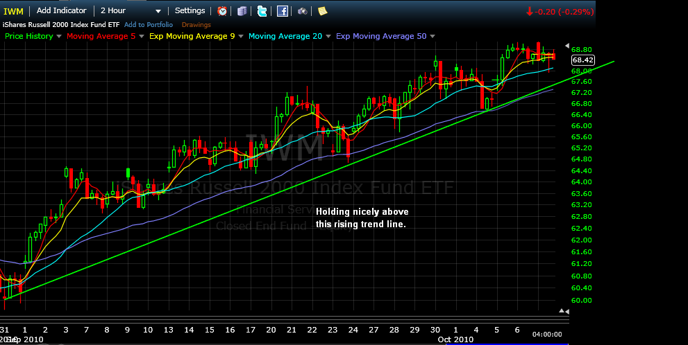
IWM broke the trend line then managed to close right on it. Will it hold tomorrow? In any other market environment, I’d would say no, but this market is the miracle market and so I have no idea. Oh, and don’t worry about the fact that the MACD and Sto keep dropping or that the ADX is very close to a Bearish DI X (Corrected) . I mean, come on.
Click here to open chart in new window.

ETF Investment Outlook, link to your right, calculates Summation Index’s for many of the popular ETF’s, including IWM, IYR, and a bunch of others. I’m still getting used to using the site, but you should have a look.
Cumulative $NAAD continues to exhibit signs of weakness and reduced participation. If this doesn’t change pronto there is just no way the $COMPQ, which is the defacto leader of this rally, can maintain its parabolic move. But, you know, seems like I’ve been saying that for quite a while, doesn’t it?
Click here to open chart in new window.

Chart courtesy of StockCharts.com
Update October 28th, 2010
***Added at 8:10am on 10/29/10: Ceridian’s Pulse of Commerce Index suggests a GDP between 0.7% & 1.7%***
The mad men at the helm have ten times the data that we mere mortals have access to. THEY know what’s going on. THEY know that the market is rising on less and less participation, but it doesn’t matter. All THEY have to do is pump the highly weighted stocks, and the rally continues.
For instance, UPS was down 1% today and its chart is trash and no amount of propping can bring it back, so THEY pump FDX from down 70 cents to up 70 cents, and they do it in the blink of an eye, and $TRAN pulls out of its nose dive and almost closes green.
Meanwhile the Miracle, One-Color, Supernatural, Magical, Mystical $COMPQ defies clearly weakening internals and rises 4.11pts, even as AAPL closes red.
It’s getting out of hand.
But it’s very important that we all understand the significance of the phrase ‘providing liquidity,’ which means, in layman’s terms, “We buy dips.” So this morning when the markets were selling off, the HFT outfits, Market Makers, and assorted hedge funds were providing liquidity and buying shares of stocks no one apparently wanted. But THEY don’t do this out of common decency. No, THEY do it to make a profit and the only way to make a profit is to start buying shares at the market which then creates a back draft of buying by retail investors which the HFT outfits sell into. And they’re margined out 20-30 times so a 1% move nets them huge gains.
But I digress.
Chart of cumulative $NAAD showing another day of a drop while the $COMPQ rises. I think this is historic. If I have the time I’ll check, but I don’t recall when I went over the charts of $NAAD and $COMPQ any other period where the $NAAD fell for two days while the $COMPQ rose for two days. One day of going backward was all I recall. Check for yourselves.
Click here to open chart in new window.

Chart courtesy of StockCharts.com
I don’t know how much longer the market can be propped up. Two weeks ago I stated that I thought this would be the week we’d see some obvious signs of selling. We have, but not that much. $SPXA50R dropped again today, but $BPSPX rose. Weekly chart of $NYSI is rolling over and weekly chart of $NASI is on the verge of doing the same. Cumulative $NYUD/CVI dropped today while the $NYA added 28pts while the $TRIN closed at 1.11 indicating more stealth distribution. $NYUD hasn’t taken out the first support level, but it’s just a hare’s breath away. And thanks to KRE, IWM continues to under perform.
Be careful.
Update October 27th, 2010
**Adding this about 11:15pm ET: $NYMO almost tagged its lower BB today and it’s probably close enough to initiate some kind of bounce or consolidation tomorrow, Thursday, 10/28. The last time $NYMO tagged its lower BB was on 10/19 and the market halted its decline then and entered this upward, sideways consolidation we’ve been in ever since. $NAMO came close to its lower BB so same thing there.**
***Added 9:00am ET October 28th: Regarding this discrepancy between the $COMPQ and cumulative $NAAD, I went back to the March o9′ lows and came forward looking for other instances similar to the one from yesterday. I found five such instances. One of these had no impact on the markets. One preceded a one day pull back by one day. Three preceded multi-day pull backs. The current discrepancy is the most radical of the ones I found. From the action in the PM so far, it appears that this obvious sign of market weakness will not alter market direction. Today.
Here are the dates:
November 16th, 2009
December 28th, 2009
February 3rd, 2010
July 14th, 2010
Equally important is when you see $NAAD ticks up while the $COMPQ is in a down trend. That appears to be the day you get out of shorts and go long.***
$NYA close to having a DI bearish X, but close doesn’t matter. I have a little chart I call the mechanical trading system, which I’ll put up one day, that is very close to giving a sell signal on this important index.
IWM down on heavier volume and one day away from Bearish DI X. IWM is also in a symmetrical triangle pattern on the daily chart. This has a 75/25 chance of breaking to the upside. If you remember, XLF was in a similar pattern, did break out topside, but then crashed back through the pattern a few days later. Not saying this is going to happen to IWM, just sayin’.
IYR looking weak and very close to a sell signal.
RTH looking bad here, also close to a sell signal.
Of course, whenever I mention any of the weak sectors, they get rallied the next day, so there you go.
$BPSPX rose today.
$SPX50R continues to drop.
$NAHGH went backwards today, which is interesting because the $COMPQ seems unstoppable. However, $NASI had a negative tick today and that should not be happening in this supernatural, almost mystical index. Seriously.
$NAA50 & $NAA150 went backwards again today. See bottom of yesterday’s post for the chart.
$SPX tested the trend line, and the trend line held. I usually say that’s all that matters, but I’m not so sure this time. It’s the next chart that is bothering me.
Click here to open chart in new window.

This chart of the cumulative $NAAD is not right, or happy. I haven’t had much time to back test it, but instances of this kind of divergence appear to be very rare. Even in April, $NAAD managed to stay in step with the $COMPQ, it just put in lower highs so you had some negative divergence. But it went up when the $COMPQ went up, which is the key. Same in August. $NAAD stayed in lock step with the $COMPQ, but at lower and lower levels so you had negative divergence. This is the first instance that I can find where $NAAD went completely in the opposite direction, and that ain’t right. Also, sometimes data is updated as the evening wears on and there is a chance that the chart won’t look anything at all like it looks at the moment, but until then….
Click here to open chart in new window.

Finally a chart of the cumulative $NYUD/CVI just as a follow up. The upper support line held today but does look to be in jeopardy. Only a very strong up day tomorrow will prevent $NYUD from dropping down through the upper trend line.
Click here to open chart in new window.

Charts courtesy of StockCharts.com
Update October 7th, 2010
The little stock market of horrors.
Once again we’ve got these negative divergences setting up, this time in the $COMPQ. These always bother me, but I do not have sell signals on anything, except may XHB, so this is probably going to resolve like it has over the past three weeks with a 90% up day.
While the $COMPQ rose by 3.01pts today…
$NAHGH went backwards.
$NAUD, the cumulative, went backwards.
$NAAD, the cumulative, went backwards.
$NAA50 went backwards.
$NAA150 dropped by one issue.
$NASI rose by 8 digits which means that $NAMO is getting very close to the zero line.
Also,
$NYSI rose by less than a point and without some kind of rally tomorrow, this will drop the $NYMO below the zero line. Its +DI line rose by only 0.06bps.
One day these negative divergences and other signs of weakness will impact the market but until they do and until trend lines fail, then you have to have a bullish bias. So far, every time the market looks like it wants to roll over, it’s been a sucker set up for shorts. Don’t be a sucker.
IWM still looks good despite having back-to-back red closes.

Chart courtesy of FreeStockCharts.com
Update March 15th, 2010
Here are the numbers, which are starting to roll over. I haven’t had time to look at these on a chart, but I don’t think they’re enough to tag the trend line, yet. I think it’s close, though.
As I said last week, by Tuesday or Wednesday of this week I expect to see a stall in one more important indicator that I use. By then, a couple of the others I use may also start showing signs of weakness.
$SPX = 89.38, down from Friday’s 91.56
$COMPQ = 85.70, down from Friday’s 87.97
Spreadsheet is updated.
You can see a complete reversal taking place in the advancing volume vs the declining vol on the NYSE. Until Friday of last week, advancing volume was coming in close to 2:1 almost every day. Today it was almost 2:1 the other way.
Cumulative $NYAD and cumulative $NAAD also took some pretty big hits today.
Error clean up. On the chart of the transports with the Aroon Oscillator that I put up over the weekend, I labeled two of the Aroon peaks with readings of 90. They were actually readings of 100 on that oscillator. This is important because the Aroon Oscillator on the $TRAN hit 100 today.
For those of you who are new to the site, I don’t have time to explain how I use the Aroon Oscillator, but you can click on the tag and find other mentions that I’ve made of it.
With the RSI on the $TRAN now above 75 and the RSI on RTH at 77, it is time to be extremely cautious, IMHO, of course.
Weekend Update March 14th, 2010
Here are a couple of things that may or may not be a factor in the week ahead.
On March 9th, the ISEE Equities only number hit 253, the highest reading for this since October of 2007. This indicates extreme and/or irrational exuberance.
Intra-day P/C ratio opened at .57 on March 10th. Another sign of extreme market optimism.
Head over to Cobra’s Public Charts at StockCharts, link to your right, and look at chart # 0.0.9, the Extreme P/C Ratio chart.
Tom Drake’s 2CS hit 73.14 on Friday. When this gauge goes into the 60’s, then it indicates extreme bullishness. 73 is pretty close, but is it close enough?
While many of the major indexes and key sectors have made new rally highs over the last two weeks, there is a non-confirmation in the $INDU, $NYA, and $CYC. Here is an article by Tim Woods that explains why this is important to watch. A decent rally early in the coming week will eliminate this non-confirmation.
$VIX is close to giving an early buy signal, but $RVX & $VXN are much, much closer with their full sto’s already above 20 and a MACD bullish X only a hare’s breath away.
$TICK closed at 1011 on this past Thursday. So that’s three closes above 1000 in the past couple of weeks.
$TRIN dropped to .32 at the open this past Friday, then quickly jumped up over 2.xx. It then settled down. Normally I would say that could cause a pause the following day, but I’m not going to say that now. Just watching.
The cumulative $NYAD had a strong up tick on Friday, but the cumulative $NAAD had a fairly substantial down tick. Could just be a one day event.
Bullish Percent’s of all major indexes and key sectors are up at high levels, but still have a wee bit more headroom. $BPTRAN is at 90% and can go to 95%, where it can stay for a couple of weeks.
Couple of charts of the $TRAN. Notice what happens to the transportation index when the RSI rises above 70. Interesting that when $TRAN dropped in January it found support at those August highs.

This chart has those mystery BB’s with the MUST HOLD support level at around 4000. While I do think the transports are extremely overbought and ready for a pause day or two, I have no idea what that will mean. They could pull back, consolidate sideways, or drop off a cliff. Let’s just see what happens in the first days of this coming week.

Lastly, a chart showing a steep trend line. Nothing happens in the markets until the $TRAN decisively breaks that trend line coupled with a bearish MACD X. You’re delusional if you think otherwise. However, the Ceridian report, which is linked at the bottom of my Friday post, suggests that $TRAN may have gotten ahead of itself.

Charts courtesy of StockCharts.com
Along with everything else I normally watch, I will be paying close attention to RTH in the week ahead. RTH rolled over in late December, a couple of weeks ahead of the market. When it came off the bottom in early February, it screamed higher and put in a new rally high at the end of February, beating the other leading sectors to new highs by a full week. Will it be the first to show weakness this time? Paranoid traders want to know.
Lowry’s Data has been updated.
